DIBI 2016
A rich, diverse range of talks and people meeting together to talk designing great UI and UX for the web.
This has been my first time to a conference north of Hadrian's Wall in Edinburgh. DIBI, short for Design it Build it, was previously held just south of the wall in Newcastle. It possibly hadn’t held the same appeal as Scotland’s capital to potential delegates from more further afield like myself (sorry Newcastle).
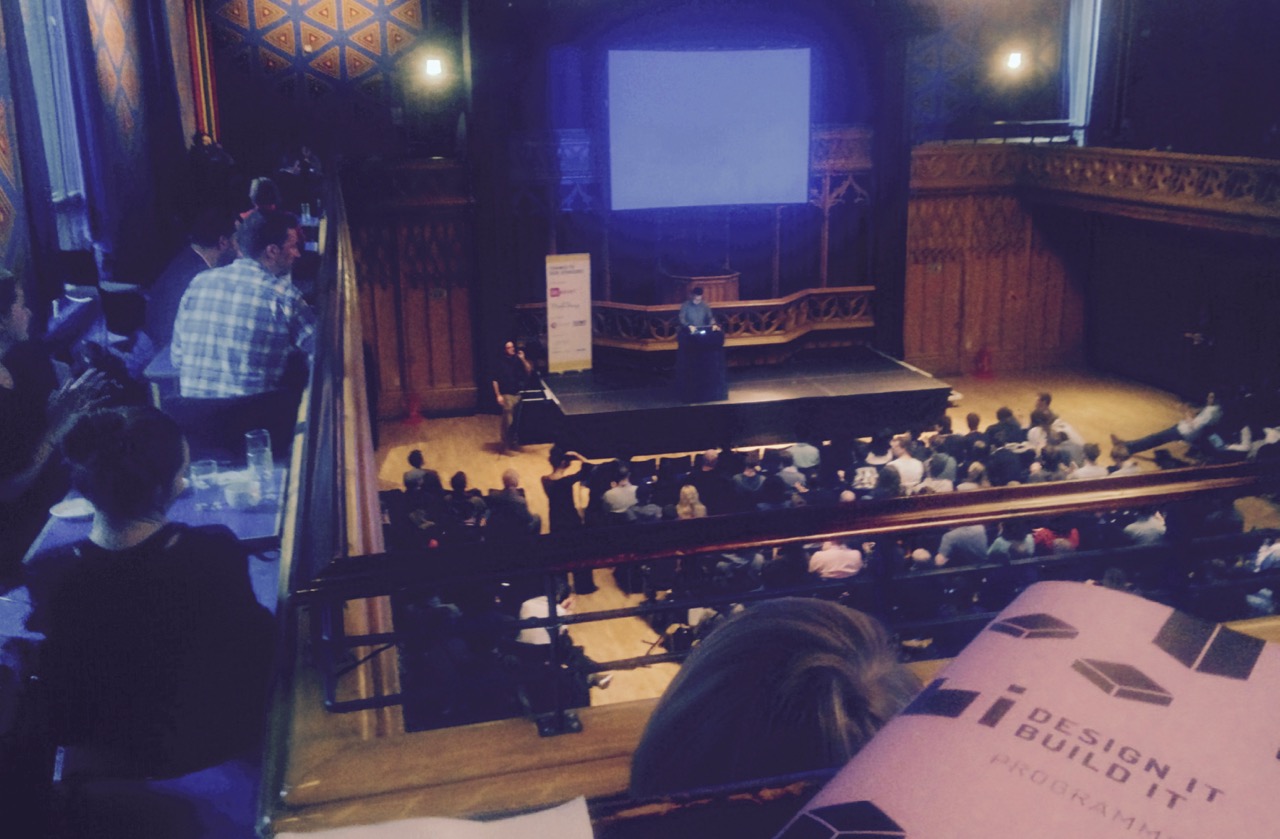
The grand venue chosen was The Hub just a stone’s throw away from Edinburgh Castle and suitably large for the 400 or so digital makers and designers. This was definitely a conference focused predominantly on the discussion of user experience and design; from the perspective of standalone designers as opposed to hybrid designers/developers or front-end developers. This is by no means a criticism but an observation which I found pleasantly different from code-heavy, technical presentations I often see at local meetup events.

New Yorker Cap Watkins of BuzzFeed took the brave leap as first speaker for DIBI 2016 and talked about his past experiences and work history in building up a successful career in digital design. My main takeaway from his talk was to communicate and share knowledge, not only within your own work department, but to co-workers beyond this such as front-end to design, front-end to back-end and so on. This along with better organisational structures can help the individuals in traditionally hierarchical organisations to spearhead overall changes for the better.
Yesenia Perez-Cruz of Vox Media gave an excellent talk on considerations for accountable design features. In this she considered font and image sizes as part of performance budgets which are now becoming just as an important part of project design and planning as time and cost budgeting.
Ad blocking too is increasingly something to be concerned with when it comes to a heavy reliance on webfonts which may consequently fail to load and have major implications on page layout and visibility. Ultimately this and many other talks concluded that experience, communication or translation of the brand, vision or message should be considered first and foremost when designing with custom fonts, imagery and other assets.
Towards the end of the two-day conference I was very impressed by Chris Davey’s presentation of some great work done by Whitespace. The power of interactive video combined with a strong narrative was clearly a winning combination in their efforts to present promotional and educational messages on the web.
Concluding the event Danny Hearn, recently UX manager at John Lewis, gave a highly detailed explanation of the formulas for designing a customer centric approach that’s consistently successful and consistent in how it manages expectations of user needs as much as business needs. Though a lot of thought and detail had gone into this talk; I think as the last it was too in-depth and heavy a talk to digest late in the day.
Following the conference there was a small free-to-attend side event hosted by FanDuel. This was at their super modern offices in the city centre. The discussions and talks continued on the topic of UX strategy followed by some debate and questions from the audience.
Overall
I felt a lot of effort had gone into making DIBI 2016 a smoothly run and thought provoking event. It was great to hear from speakers so passionate about user experience taking a centre stage in the design processes. This was evident for sure in the talk given by Nick Finck who has recently started uxforchange.org. Given part of the name ‘build it’ I'd like it if the conference had given more attention to front-end development and building accessible, inclusive functionality on the web.
Likes (8)