Failing complexity with over simplification
This month’s issue of Net magazine has an interesting piece on Zone’s recent rebuild of South West Trains website and ticket booking engine. Based on the article I’d high hopes this agency might have pulled it off to finally deliver a ticket booking process for British trains that’s quicker simpler and better than others. My hopes weren’t fulfilled.
To fully understand my frustrations in general about buying train tickets in Britain read on; however further down you can skip to my thoughts on Zone’s attempt to improve things.
First a little history..
Over 20 years ago all of the British train operations were privatised and split up into lots of different companies. Each train company has its own website typically with the same ticket booking engine and interface as a few other train operators. On top of this there are standalone websites like The Trainline who do the same thing albeit with an added booking fee.
Most of the tickets on offer through these different websites are exactly the same deal whilst some specific to a certain train operator maybe exclusive such as seasonal discounts and other operator-specific deals.
Pressure from the public, the media and government to make buying train tickets simpler and easier has increasingly resulted in changes to the names of ticket types and ways a ticket is purchased online, e.g. for collection, posted, self-printed or in electronic form like a smartcard.
Buying a train ticket
As both a frequent user of trains and developer of websites I know well that it’s often a cumbersome inefficient process for buying train tickets online. A whole mixture of aspects can make for a poor user experience from poorly utilised web technologies, connection to the national database of train times/ticket prices and then payment card verification all taking too long. Apart from this the user journey is often fraught with several stages broken up in to different pages asking to add on local bus tickets, London Travelcards, ticket collection point location, loyalty card numbers and finally billing information!
Zone’s attempt to improve things
Much as I’m looking at what hasn’t been done well; I do commend Zone on their efforts to simplify and quicken such a complex process. They clearly wanted to identify what frustrated customers about current options for booking a train ticket. They made a booking platform that’s efficient and consistent in it’s user experience over both web and mobile applications.
Where did they go wrong?
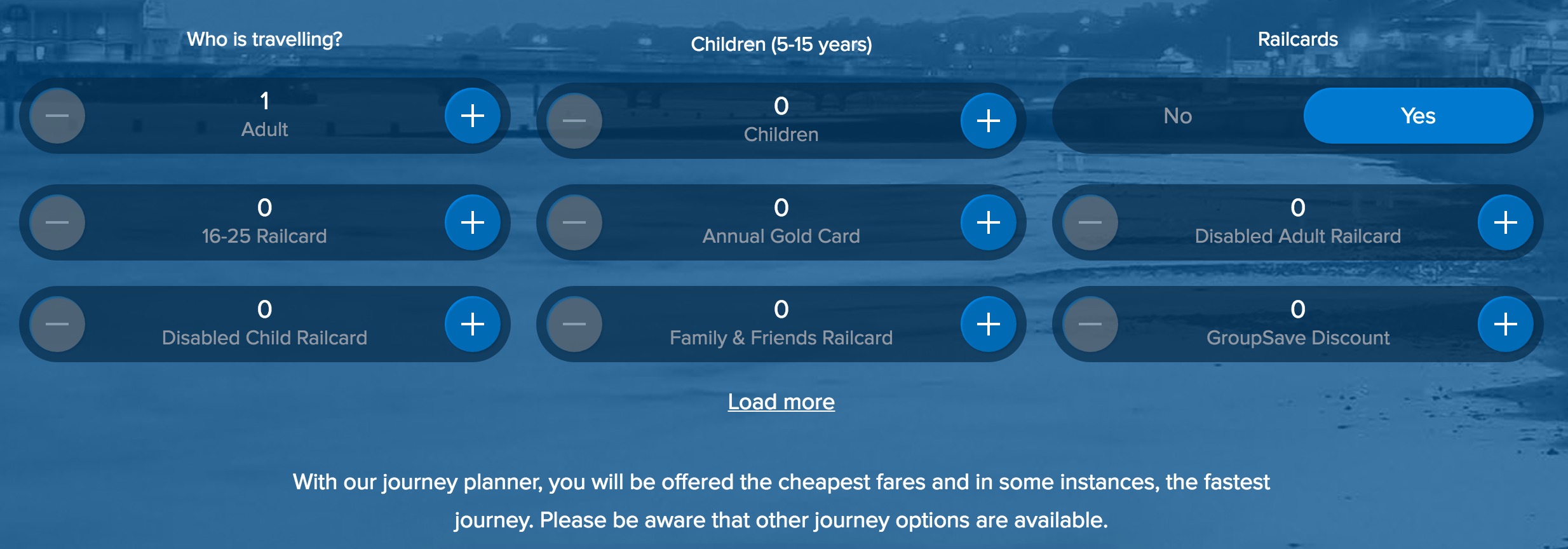
It seems they considered a limited range of use cases where the needs and objectives of a customer were perhaps specific to a certain time, travel class and route. The over simplification of the first point in the user journey here means I’m unable to filter search options for first class tickets, fewest changes and going via or avoiding certain routes that might mean I get a cheaper ticket. Further into the user journey these options are either unavailable or limited in choices made for you.
A choice of Railcard options are available at the first point of the user journey however one of the most popular to the area served by South West Trains, the Network Railcard, isn’t immediately visible.

It seems assumptions are made that users of the South West Trains’ website may only be looking for tickets on routes this train company operate over. The range of ticket options beyond these routes are more limited or search options apparent for others unavailable.
How could they do better?
I sense the keenness by some designers to model the user experience of buying train tickets on that developed by some low-cost airlines where it’s been a great success. What needs to be understood better are the many differences in train travel there are from booking a point-to-point journey by air; which is generally limited to a certain flight time and route more than time flexibility.
There are an incredibly wide range of user cases that need to be considered for this and perhaps separating the user journeys based on this would work better. Ideally these would be simplified options at the beginning of the user journey to determine what kind of customer you are, e.g. long distance versus short distance, leisure, commuter or part-time worker.
With relatively simplified use case options I think it could then be determined more accurately what kind of search options and ticket offers are made visible so as to offer the best deal and user journey for all types of user.
In conclusion
Let's keep things simple but without introducing limitations to what tickets or additional options we can buy as part of the deal.
Reference + reading
- Net magazine - Issue 284
- Zone South West Trains Project
- South West Trains
Reposts (1)