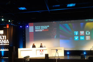
Multi-Mania 2013
Multi-Mania is a free Belgian conference done almost entirely in English; in a league that isn't far off the mega-sized technology conferences which California plays host to.

The Adobe-sponsored two-day event comes just a week after the annual Adobe MAX conference; which means we're one of the first major gatherings of people in Europe to see feature previews in the upcoming versions of Adobe applications like Photoshop, Illustrator, Dreamweaver and Edge Tools. This year sees a major shift-change in the Adobe product offering: it's now completely out with annual Creative Suite releases and in with the subscription-based Creative Cloud. New update releases will be much more frequent at the rate of once or twice a season.
Following Adobe's hour-long keynote the rest of the sessions commenced. Sessions took place over four rooms as well as the 2000-capacity main hall. Multi-Mania has such a diverse range of talks from across the entire spectrum of multimedia topics and industries. Here I've highlighted my favourite web-related sessions of Multi-Mania 2013:
Lea Verou works at W3C in Developer Relations and had come to talk about the Humble Border-Radius. She presented numerous inventive ways to use the CSS property in webpages without the need to use images and hence a solution which is a lot more scalable, quicker to download along with the possibility to animate easily.
Media Monks gave an entertaining presentation titled "Digital Production and Constructive Trolling" which consisted of some hair-raising, bass-heavy videos and show reels of their work. They're a production agency with offices in Amsterdam, London and New York along with a considerable sized workforce who develop a wide range of marketing-based campaigns including games, audio/visual productions, interactive web apps and 3D animation.
Most of us are aware of Smashing Magazine (SM) for its articles and publications on web design and development. This year Vitaly Friedman from SM came to give a presentation on Responsive Web Design (RWD) including insights of how existing websites like theirs, The Guardian and MSN 2012 Paralympics have approached RWD. Content Choreography came up as one of the key areas needed to be addressed in RWD such as ordering or displaying content differently for different viewports. Also Vitaly highlighted a number of ways to address more efficient alternatives to sprite-based images including SVG Stacks and combining icon font glyphs to create complex mega-icons.
Responsive images are another common head-scratcher in RWD which are yet to see a standard, W3C approved approach to addressing. Vitaly considered the use of object tags in place of image tags as an approach we can use now and which is supported for browsers both old and new. Finally he spoke about RWD for forms: showing us an example for inspiration, TypeForm.com, and how SM are approaching form design in their upcoming, "confidential" SM Shop redesign.
I highly recommend you take a look at his slides for further detail, view at: SpeakerDeck.
I left Multi-Mania with fresh insight and inspiration of how we can better approach the challenges we face as makers of the web, now and in the future. The international flavour of this Belgian conference also offers a different perspective on design and development practises, which I think can be missed in exclusively attending the conferences and events we have here in the UK.